Details matter, but they are getting lost.
At Apple I worked on the main User Interface (UI) framework called AppKit for about 13 years. I would help enforce UI consistency in applications by logging bugs and helping the application developers fix any issues. Back then a lot of people really cared about consistency and the small details really mattered. I just installed macOS 12.0.1 Monterey and I have found that the system is moving away from being homogeneous. Application-to-application consistency is getting lost, and it is becoming more like the web where every website is different. Part of the problem is the lazy-port of iOS applications over to macOS via Catalyst.
It is easy for me to complain about issues, but I also take time to log bugs in Feedback Assistant for Apple and hope they fix the problems, but in the past three years since I left not much has been addressed.
Sidebar Flashing
Catalyst apps, like News.app, suffer flashing issues when the application is brought in and out of focus; us developers call this the “key window”. Quickly Cmd-tab from any app into News.app and you’ll notice that the text and sidebar text flashes in to the proper dark color after a slight delay. The key window is not drawn key at the same time as the text, and the text color is re-drawn on a slight delay afterwards. This has happened since day zero when News.app was released, and I logged the issue a while ago (FB7880685).
I took a video of the problem and here’s a screenshot from it showing the issue; the News.app window is no longer focused which can be noted with the gray title bar buttons, but the text is still black. A brief moment later the text color will pop and transform to the proper non-key gray color.
Once you see the flashing you won’t ever not see it. I’m not sure how the Human Interface (HI) group at Apple let an issue like this slide, and not only that it has now appeared in three versions of the OS.
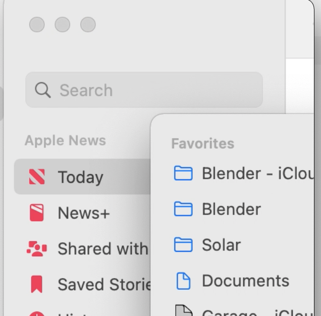
Sidebar Text Layout
I used to work on the underlying tables of macOS so I’m particularly sad to see them have issues in text layout. Here’s a zoomed in screenshot of Mail.app on the left and Finder on the right.
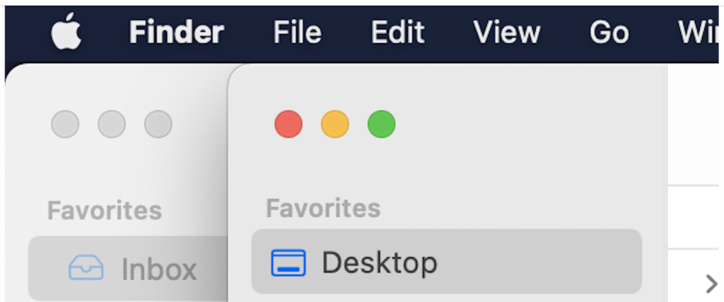
The problem is obvious: the tables have an inconsistent layout, where the selected row in Finder is a bit higher than Mail.
I saw this issue in macOS 11 and reported it back then as FB7880226, but I’ve previously noted the sad state of logging bugs at Apple and it is no surprise to me on how they handled this bug. It came back as “potentially fixed in macOS 12”:
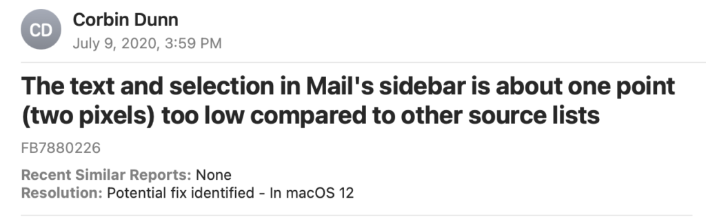
Of course, it wasn’t actually fixed, and obviously no one even checked it if was fixed. They just sent the bug back to me assuming it was fixed. This is extremely lazy engineering. But that is assuming the bug made it to engineering; it probably was stuck in limbo with Quality Assurance (QA) who just sent it back without even doing their QA job. I have a feeling this bug is specifically an issue with Mail.app, but I don’t know for sure.
Table Style Consistency
Look at this sweet new table style in System Preference’s “Notifications and Focus”:
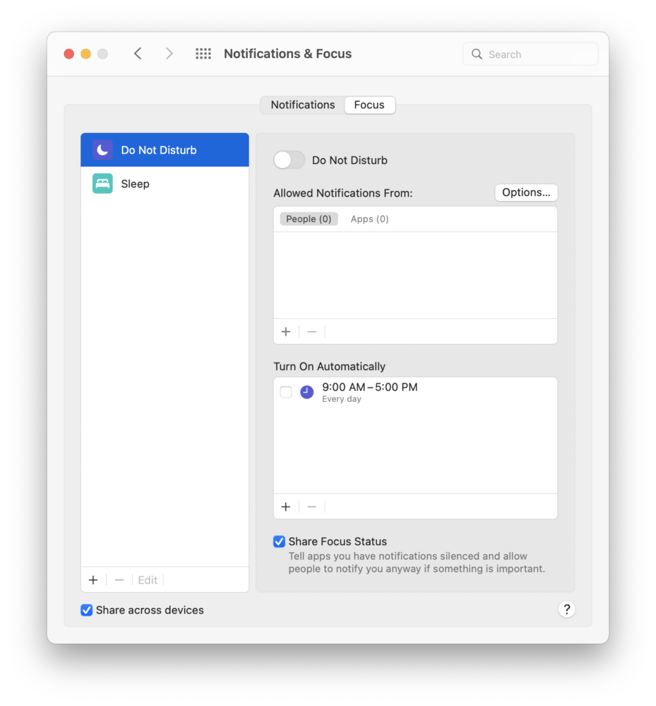
The corners are all nicely rounded, and it looks really slick. I bet one of the Human Interface (HI) designers spent a lot of time working out all these details. Normally HI would dictate that such a design be enforced across all applications across the OS.
Unfortunately, if you flip over to “Desktop and Screensaver” you see a horrific UI mess. This is in the same application, where we don’t have rounded corners on the table and there is a double-line border around the section on the right hand side:
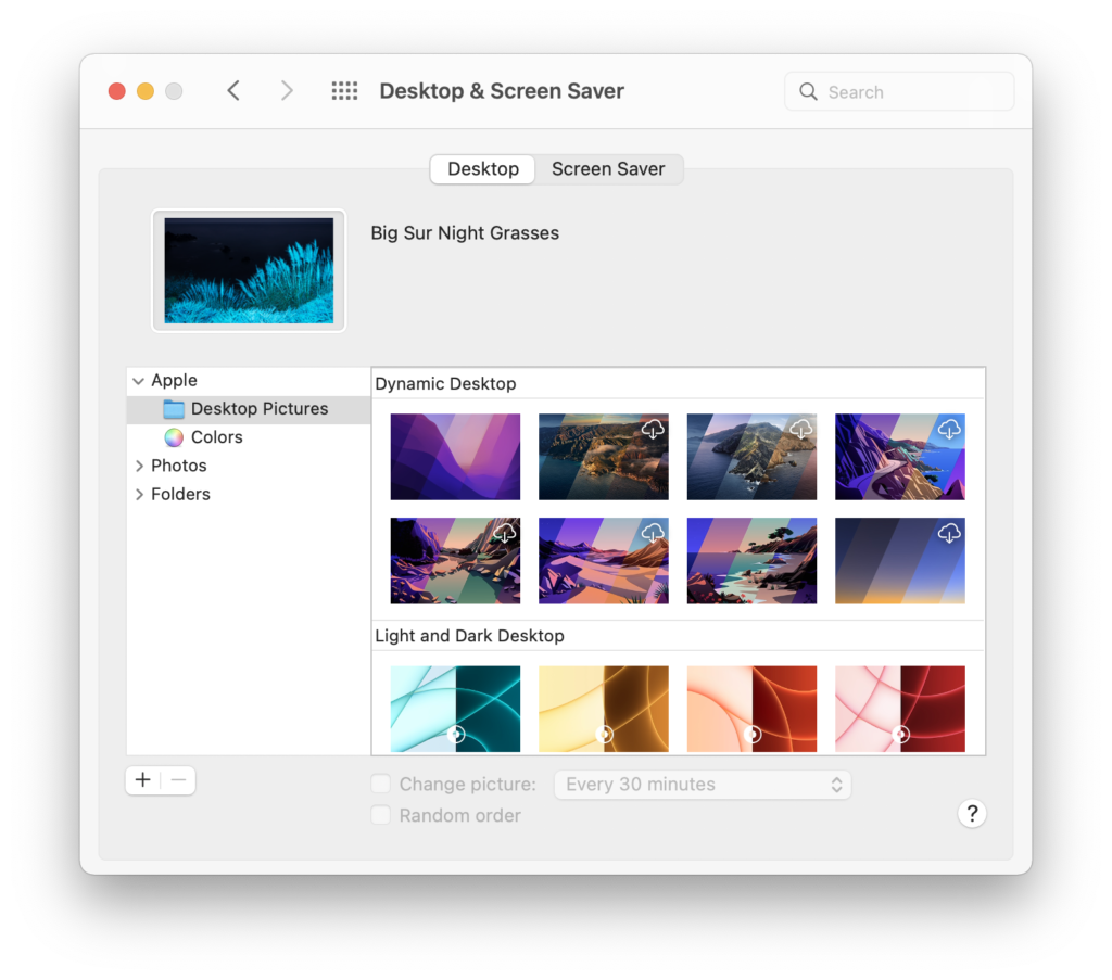
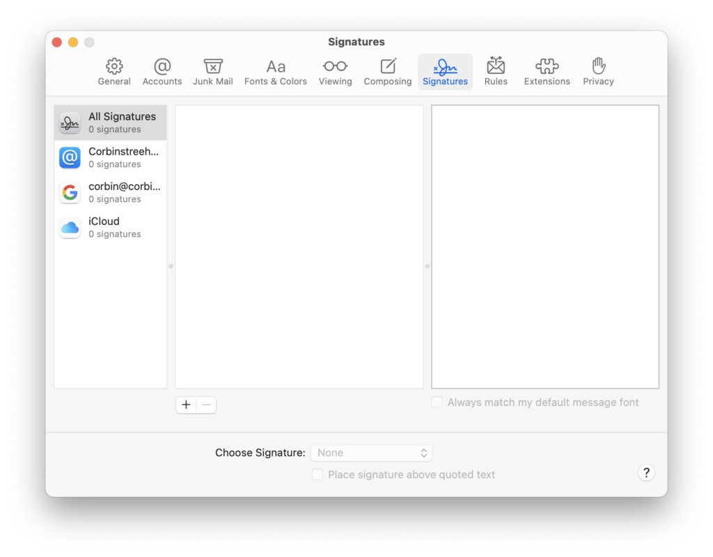
I logged this as FB9731767 for this app, but all tables throughout the system should have had this detail applied. The preferences in Mail.app could easily have had the rounded corner touch, but instead the Signatures tab has an ugly too-dark border around it.
Some apps have been updated. Finder’s preferences have a round corner around the table.
Focused Buttons State
That great new UI in “Notifications & Focus” actually has inconsistencies right off the bat, and you might have noticed it in my first screen shot. If you didn’t, here it is zoomed in:
The top plus button is a lighter gray than the lower plus button. Sigh!
What happens when you hit the plus button, and then hit escape?
Now the plus button has a disabled look, when it is really enabled!
Where are the QA engineers who are supposed to at least click on the buttons and see what happens? I haven’t taken the time to log this bug yet; it seems hopeless to do so.
Conclusion
I know a lot of my old colleagues spent a lot of time on macOS Monterey. It’s easy for me to focus on the bad things, and to not even mention a bunch of the cool new things like the new Popover animation. I’m not trying to downplay all the good work, but it is important that we don’t forget about the details.


[…] Corbin Dunn: […]
My understanding (in 2009-2012) was that macOS didn’t have an official QA team. Has that changed?
It certainly _should_ have dedicated QA engineers. Nothing that I’ve seen in the last few releases suggests that it does.
macOS always has had QA engineers since I worked at Apple starting in 2005. sometimes it was only two people for AppKit, and they were part of the AppKit team. Before I left they pulled the QA engineers out to their own dedicated QA team. They still did the same stuff, but they reported to someone else.
I’m afraid the fit and finish of macOS has been in decline for years and years, but some of the UI stuff in Big Sur is just plain bad. Sure, the proportional rounded corners look nice, but watch a dialogue box when you click the grey, non-default action button, and see how the blue default button is the one that displays the biggest visual change by turning grey, while the already-grey secondary action just turns a slightly darker grey. Took me several double-takes and double-checking before realising that hitting Escape wasn’t in fact selecting the default button. Really stupidly jarring.
Mouse across the menus in the Finder, and first off there’s the fact that the manu bar highlight isn’t even connected now to the menu that appears below it. They’re both in their own little rounded box. Added to that is the way that menu text items are lined up with the menu name, even at the expense of the left hand edge of the menu not lining up when there needs to be space for tick marks. The View and Window menus no longer align with the menubar highlight above them.
The Safari debacle? Yeah.
The whole infestation of window title bars with clutter to the point where some empty space might be grabbable, it might not, who knows?
Mail app refusing to let you resize the preferences window so you can actually read your accounts or signatures lists.
FaceTime audio call window making it utterly non-obvious where to click to try and move it out the way of other windows.
It goes on and on. Apple needs to stop and seriously fix its shit. The Lion/Mountain Lion and Leopard/Snow Leopard cycles of feature/maintenance releases never fully did what Bertrand claimed, but at least they acknowledged the problem. Right now Apple seems so preoccupied with just ploughing on through the version numbers as fast as possible that it hasn’t realised it’s veering off the highway and into the weeds.
[EDIT] Oh, and the Music app is just garbage.
Yeah! I agree…so many things that need addressing.
One that I filed right after installing Monterey:
If your desktop picture is bright (in the upper left corner) and you use the light appearance, the menu bar is light, as the menus are.
As of Monterey, the menu bar is *always* black for fullscreen apps. But the menus are not.
Closed (with more than 10 reports) as “works as designed”. Fire that designer! Oh, you did.
I hate dark themes but I see myself forced to use it just to get a somewhat consistent UI.
Whoa! That is terrible. I’m also not a fan of dark themes.
That’s because Apple has never understood that the color scheme should be user-definable and system-wide. This is just another thing that should’ve been fixed in the transition to OS X.
Windows, from 1991 or so until the late 2000s had a system-wide color-scheme editor. Users could set up the scheme they liked, and all properly-written apps would inherit it. I used a charcoal (“dark”) theme for 20 years.
But the vaunted Mac UI lacked any such facility, and forced the glaring inverse-video scheme on users from the ’80s until what, 2017? Embarrassing and ridiculous. Instead of addressing it properly, as Windows did decades earlier, Apple gave us one hard-coded “dark” theme that broke many of their own controls and had to be dribbled out by one app at a time. Talk about incompetent.
An irritation I have always had and still is an issue with Monterey is that the Mission Control Desktops can’t be custom named. The only way they take a name is if the user puts the app full screen. Otherwise they will just be “Desktop 1”, “Desktop 2”, etc. Mysteriously, “Desktop 2” can be moved to any position in the line-up rather than following a numbering schema that matches its position (e.g move Desktop #2 to the 4th position and it will then be named “Desktop 4”).
So you can end up with something like this for names:
And so on.
It is also nearly impossible to assign a specific app to any given desktop using the dock option. In some situations you can assign an app to “Desktop # Display #” but in others you get no option to choose a Desktop #, just a display #.
What also irritates me about the Mission Control Desktop management is that desktops will sometimes randomly change order position. That is, they won’t stick from minute to minute.
Yeah, it would be nice feature to be able to rename them! It’s all about tradeoffs when people implement new stuff; make it work and get polished, versus adding features.
System preferences is now unusable. I know understand why my retired UW-System Boomer CS professor father narc-rages when iCloud craps out. Unusable for laptops, but useable for the rare less than 0.5% of power users who still use desktop.
I’ve been away from OS X/macOS since Lion. I’ve just recently purchased a used Mac with Monterey… yes, what the heck happened?? It looks so inconsistent. My first reaction it was some sort of Linux distro with a macOS theme. I’ll sound like an old fogey, but I just want Snow Leopard back. Lion actually made me leave in the first place, but it seems things just become much worse. Oh well… maybe I’ll get used to it.
Welp… I miss Monterey now!